Ahora también puedes agregar en tu blog una imagen de Google Maps. Claro que en México no hay detalle a nivel de calles ni ninguna otra información, pero si puedes poner una imagen satelital.
Acá un ejemplo:
View Larger Map
Otra de las nuevas opciones es utilizar la vista a nivel de calle, aunque esta opción no es posible insertarla como imagen. Este es un ejemplo: link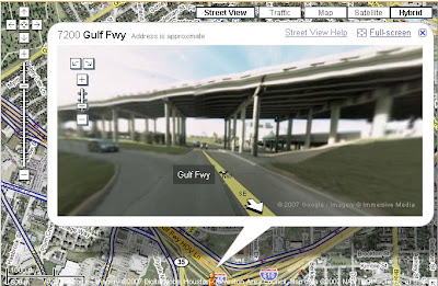

Custom Search
August 22, 2007
Google Maps en tu blog
August 20, 2007
Red Social: TierraNatal.com
TierraNatal.com es una red social dedicada a explorar, conocer los pueblos de México, así como también ayuda a conectar familias en todo México y USA.
link: http://www.tierranatal.com/
TierraNatal es una comunidad como ninguna otra. Aquí celebramos y apoyamos las conexiones entre familias y amigos en todo México y Estados Unidos.
En TierraNatal tú, serás un periodista ciudadano. TierraNatal es una comunidad en la que tu participación es esencial. Tu podras:
- Conectarte con amigos y familia en México y Estados Unidos
- Explorar todas las ciudades, municipios y pueblos de México
- Reportar las últimas noticias de sus pueblos y mucho más
Aquí tu podrás comentar sobre acontecimientos que sucedan en donde vives, compartir tus fotos, videos, darnos noticias de tu vida cotidiana, compartir poesías y ensayos y mucho más. Tú eres el reportero de tierranatal.com. Lo que contribuyas será visto por millones de personas y juntos haremos noticia.
TierraNatal es una manera divertida de mantenerte al tanto de tus amigos y familia o un lugar donde puedes hacer nuevos amigos que comparten tus pasiones. TierraNatal es una comunidad abierta y esperamos tus contribuciones y criticas constructivas. Esperamos tu participación!
August 13, 2007
Bar Code Diagram
Publicado en: http://www.barcodeart.com/science/science.html
Aquí una explicación bastante clara de como funciona un código de barras.
When I was a child I stumbled upon a simple diagram that explained some of the elements found in a basic supermarket bar code. I was fascinated by it's complexity and at the same time I couldn't believe how easy it was to understand. I remeber feeling like I had found the ultimate decoder ring.
Continuar aquí.
August 5, 2007
Free Icons
xyberneticos.com acaba de publicar este post que está muy bueno; se trata de 100 iconos en formato png totalmente libres. Podrás aprovecharlos en tus aplicaciones
espero les sean de utilidad
Original Post
Link directo
August 2, 2007
Walmart Uses 4,300 Unpaid Teenagers As Baggers In Its Mexican Stores
En México no tienen impedimento para hacerlo, pero creo que sería bueno que invirtieran parte de sus ganacias en algún buen programa de becas o algo que se de beneficio para los chavos!
Walmart is Mexico's largest private employer, according to Newsweek, and that doesn't include the 4,300 unpaid teenagers that it lets "volunteer" to bag groceries at its Mexican stores.
read more | digg story
Barra de % en AJAX
Echenle un ojo a este post de xyberneticos, se trata de una barra para presentar el procentaje de avance de una tarea utilizando AJAX.
Link
Preview:
August 1, 2007
Nseries, respuesta de Nokia al iPhone
La empresa responde ante la amenaza del iPhone con sus teléfonos, cuya ventaja principal sobre el nuevo producto de Apple es la velocidad de navegación por internet.
Creo que todavía falta mucho para que en nuestro país logremos tarifas bajas... seguiremos esperando.
read more | digg story
Otra fuente
Pixels Are The New Pies
Fuente: http://www.dashes.com/anil/2007/07/pixels-are-the-new-pies.html
Pixels Are The New Pies
July 31, 2007
An interesting infographic trend: Square blocks of color are now being used to represent percentage-based statistics instead of the traditional pie chart. Some recent examples are shown here.

The chart on the left is from a NY Times story on atheism and the afterlife, making its choice of colors seem a little weird. And is that empty white block in the center supposed to represent the empty hole in our souls? On the right, a detail from a Wired story on how much Americans spend on gadgets. Charles M. Blow created the graphic for the Times; Arno Ghelfi did the honors for Wired.
This switch raises some interesting questions.
- Is the square format more familiar to readers now because of the preponderance of the pixel in pop culture?
- There's a lot of leeway in choosing the shape of individual regions, since the only constraint is that they use the proper number of squares -- what are the best practices here?
- Finally, a productive use of all that time spent playing Tetris?
- How come it took so long to figure out that pie charts are pretty hard to actually glean data from?
- Was there a "Designing For Print" conference somewhere six months ago where a speaker made a particularly compelling case for squares over circles?
Somewhat obliquely related, my series of posts last year on 100 Perfect Pixels, featuring Nike Plus, Amazon's Gold Box and Vox's Neighborhood.
Subscribe to:
Posts (Atom)


